Using Quick Charts with Analytics: An Example
Cindy Kelly, the guidance counselor at Bay Middle School and an Aspen
system administrator, is comparing the number of student absences for
this year for all schools in the
To use Quick Charts with Data Analytics:
- Cindy logs into
the
- From the Dictionary menu, she selects Attendance by Student.
- She then clicks
 and selects Bar Chart
to bring up the Quick Chart pop-up for bar charts.
and selects Bar Chart
to bring up the Quick Chart pop-up for bar charts. - She clicks
 in
the Categories (Horizontal
Axis) section to the right of the Group
by field to open
a pick list, and chooses School
for the Table and Name for the Group
by field. She clicks
OK to save her selections. For
the Series (Legend Entries), she clicks in
the Series (Legend Entries)
section to the right of the Group
by field to open a pick list. She specifies Attendance
by Student for the Table
and Absent Total for the
Group by field. She
clicks OK to save her
selections. She selects Total
summation for the Interval. This
will provide the sum of the values in the Absent
Total column for each school in the
in
the Categories (Horizontal
Axis) section to the right of the Group
by field to open
a pick list, and chooses School
for the Table and Name for the Group
by field. She clicks
OK to save her selections. For
the Series (Legend Entries), she clicks in
the Series (Legend Entries)
section to the right of the Group
by field to open a pick list. She specifies Attendance
by Student for the Table
and Absent Total for the
Group by field. She
clicks OK to save her
selections. She selects Total
summation for the Interval. This
will provide the sum of the values in the Absent
Total column for each school in the - She accepts the default for the Format and clicks OK.
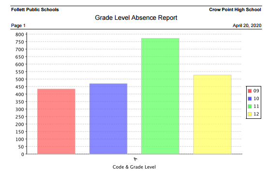
The resulting bar chart appears: