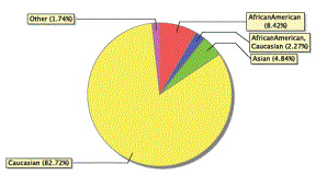
Quick Chart Example: Pie Chart
The affirmative action committee for the Aspen school
To create the pie chart:
- Cindy logs on
to the
- She then clicks
 and selects Create Quick
Chart to bring up the Quick Chart Wizard.
and selects Create Quick
Chart to bring up the Quick Chart Wizard. - In Step 1 of the Quick Chart wizard, Cindy selects New report and clicks Next.
- In Step 2 of the wizard, Cindy selects Quick Chart - Pie for Report Type and Standard Pie Chart for Format and clicks Next.
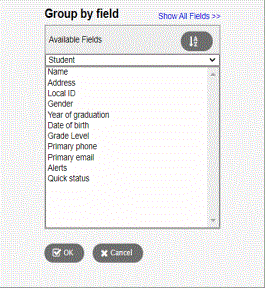
- In Step 3, Cindy
selects the field to be used for the pie chart. She clicks
 in the Categories
(Horizontal Axis) section to the right of the Group
by field to open a pick list. She can choose any of the available
fields from the current list. Because she is specifying a chart
where each slice of the pie represents the number of students in each
of the possible values for the Race
field, she selects Student
for the Table, and Race
for the Group by field. She
then clicks OK to save her selections. She clicks Next.
in the Categories
(Horizontal Axis) section to the right of the Group
by field to open a pick list. She can choose any of the available
fields from the current list. Because she is specifying a chart
where each slice of the pie represents the number of students in each
of the possible values for the Race
field, she selects Student
for the Table, and Race
for the Group by field. She
then clicks OK to save her selections. She clicks Next.
-
Note: If you don't see the Race field listed, click the Show All Fields link at the top of the pick list.
- In Step 4, Cindy
enters Aspen School
- In Step 5, Cindy selects Save as and enters Students By Race in the Name field and clicks Finish.
The resulting pie chart appears: